we just wrapped our Spring quarter at @diabrowser. before i jump to the next big thing (!), a short behind-the-scenes on one of my favorite projects to date: artifacts! the design challenge: how do you make AI-generated docs that don’t *feel* AI-generated? (🧵 1/10)
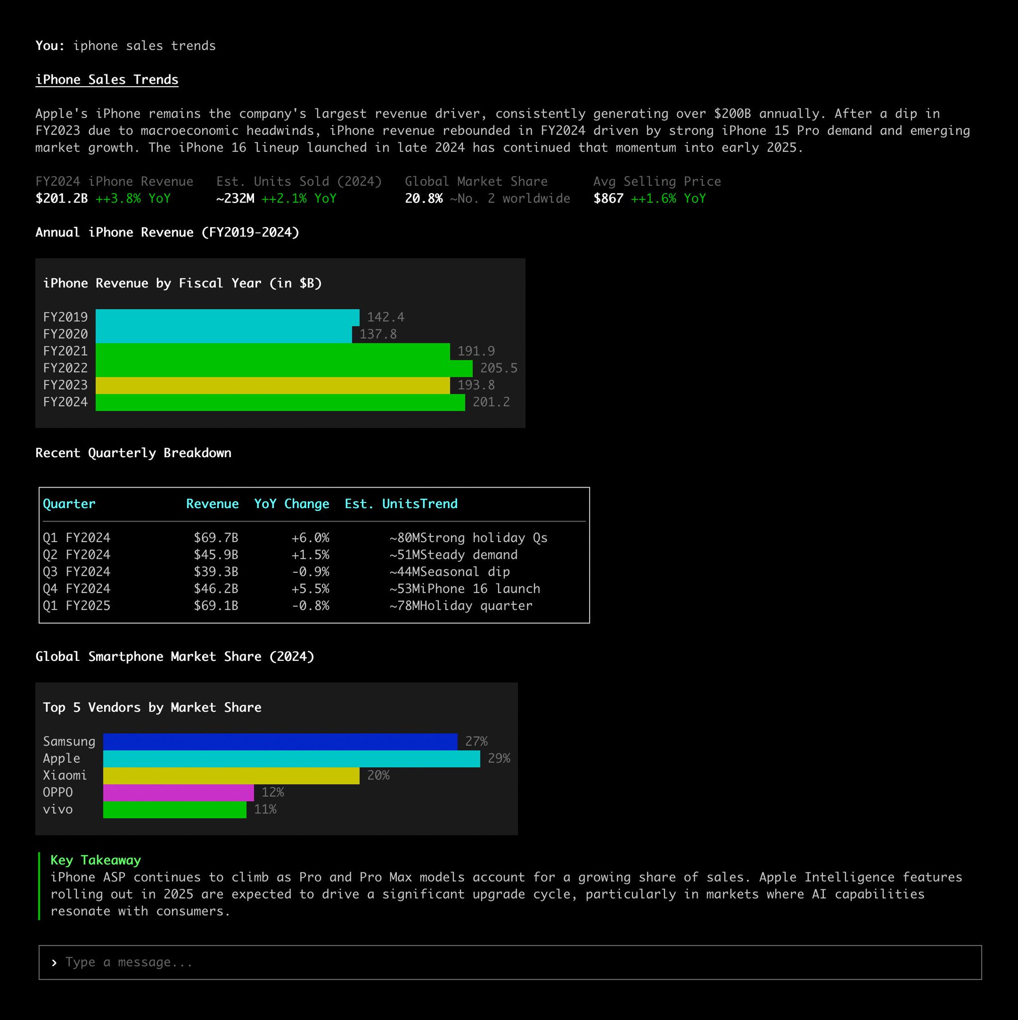
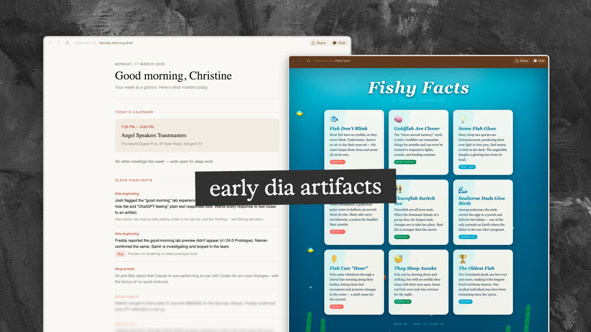
we started prototyping Dia Files in Feb, and instantly found internal PMF. it was a richer, better way to read and share insights, vs. plain ol' chat responses. then the novelty wore off. the beige Claude look gets old. or you ask about fish, you get a page that looks like the ocean — fun, but hardly something you send your boss.
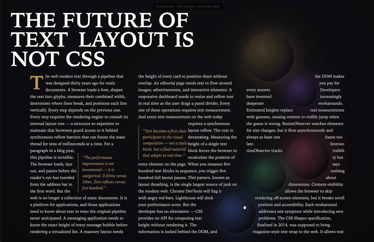
we wanted files made by Dia to feel elevated, consistent, well-crafted. designed, but not *over*-designed — the content should always come first. so i explored: what’s the very opposite of AI-generated slop design?
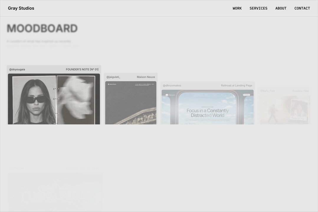
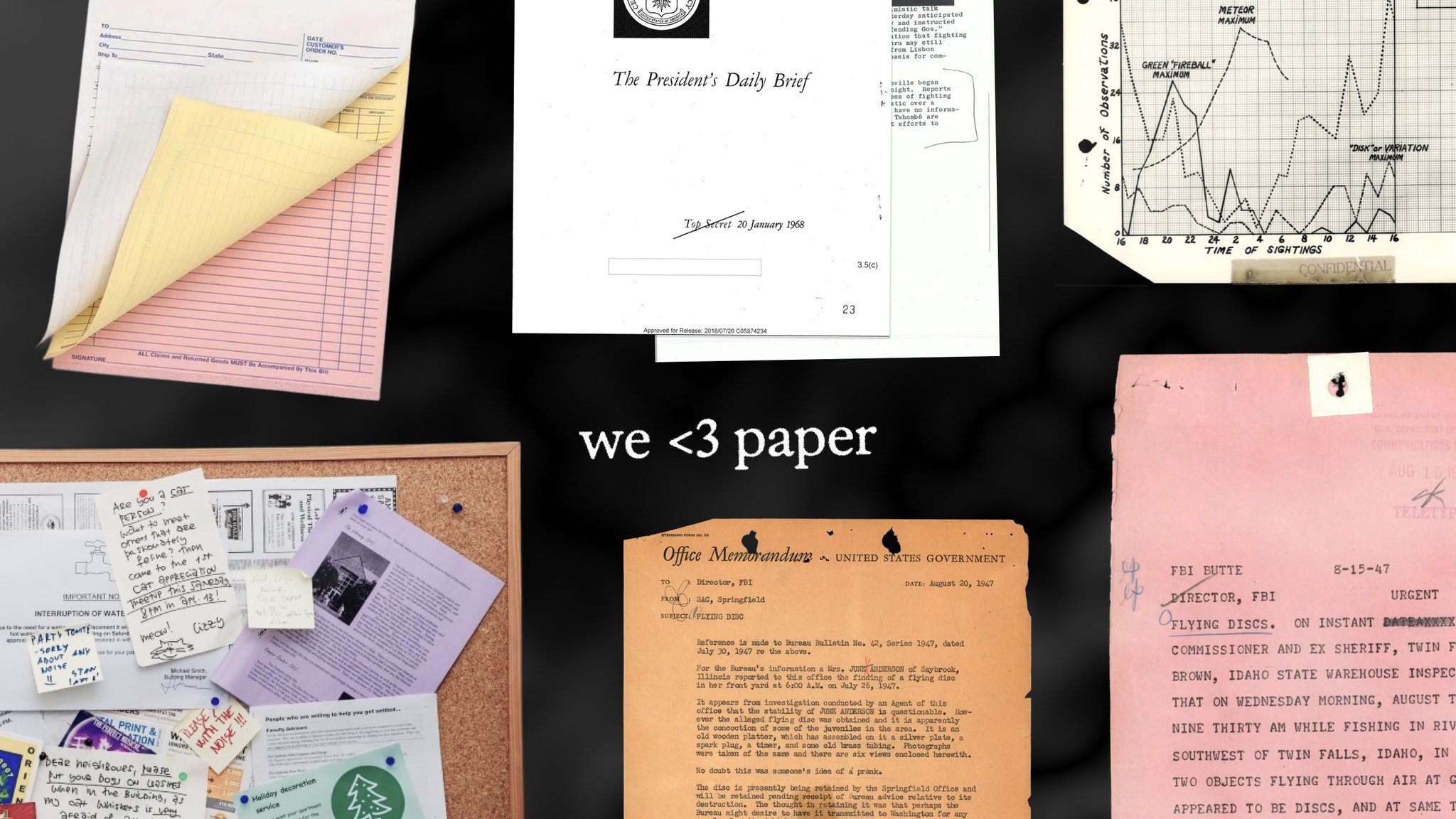
i kept landing on old physical media. memos. typewriters had no bold, no italic. metal type came in three sizes. more colors cost more money, so you make do with one. that became the thesis: in a world where full-fidelity interactive websites are cheap, constraints are a perk.
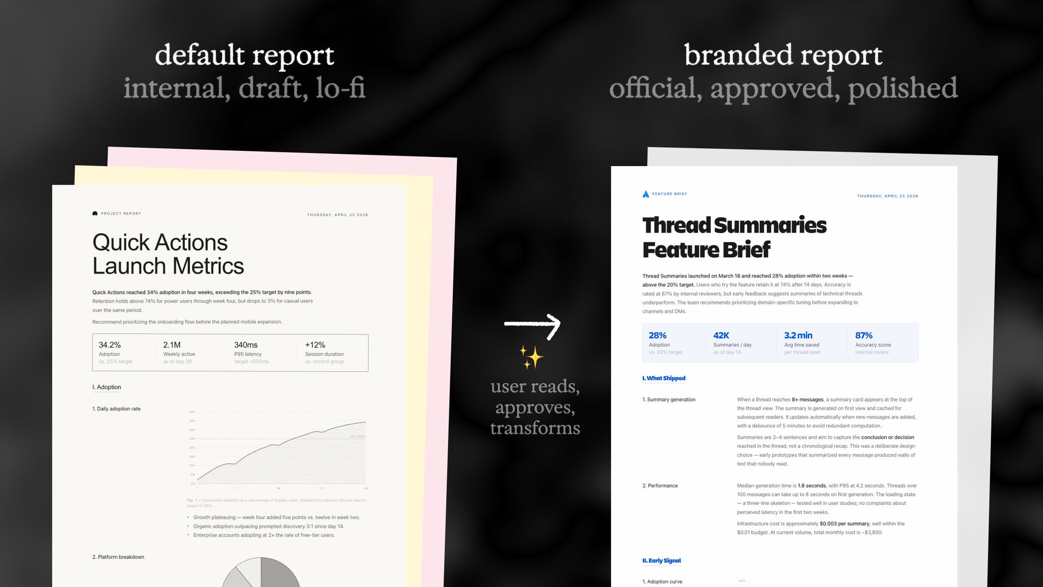
the trick is in the balance. too rustic and it's unpleasant to read. too polished and it looks too finished, authoritative, or vibecoded. the sweet spot is “you asked your assistant to do some research, and they came back with this.” a rough draft, for your consideration.
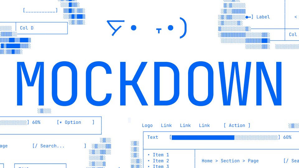
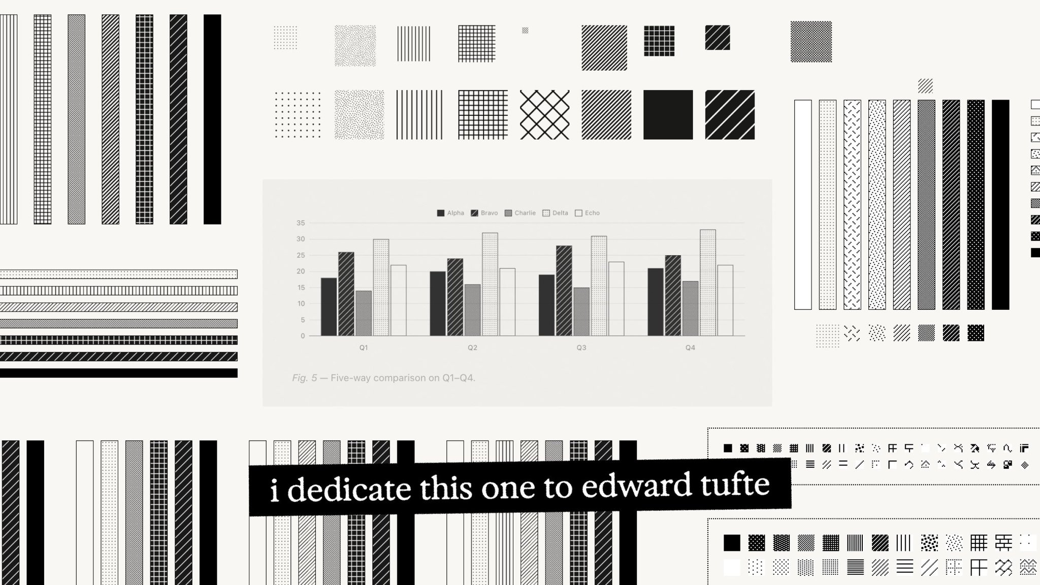
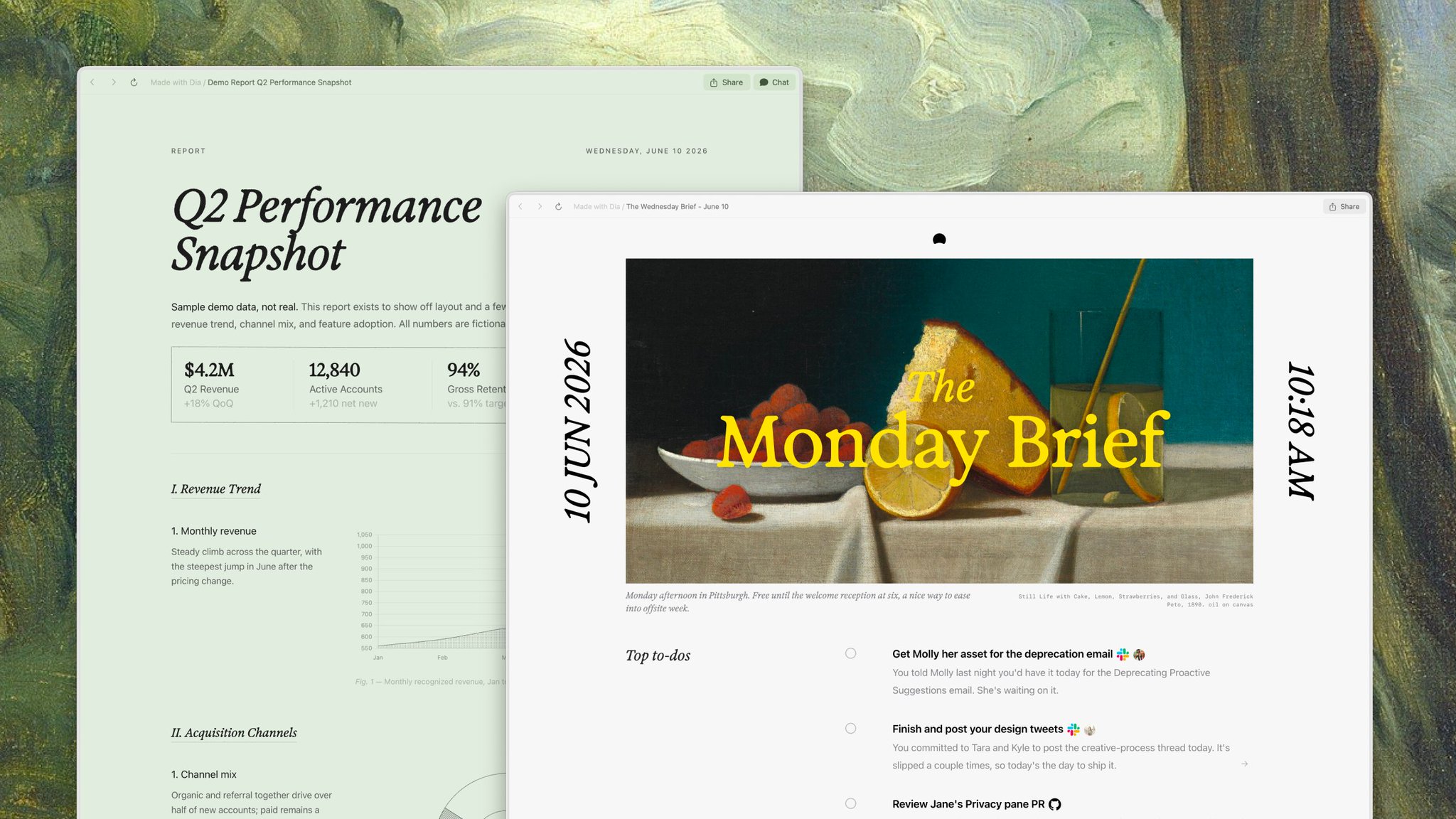
printed out, ready on your desk. black & white, cheap paper. still warm from the xerox machine. still beautiful. (cue me going mildly crazy hunting for the perfect crosshatching textures so charts could be rich even without color.)
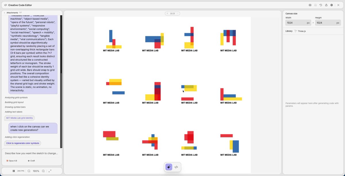
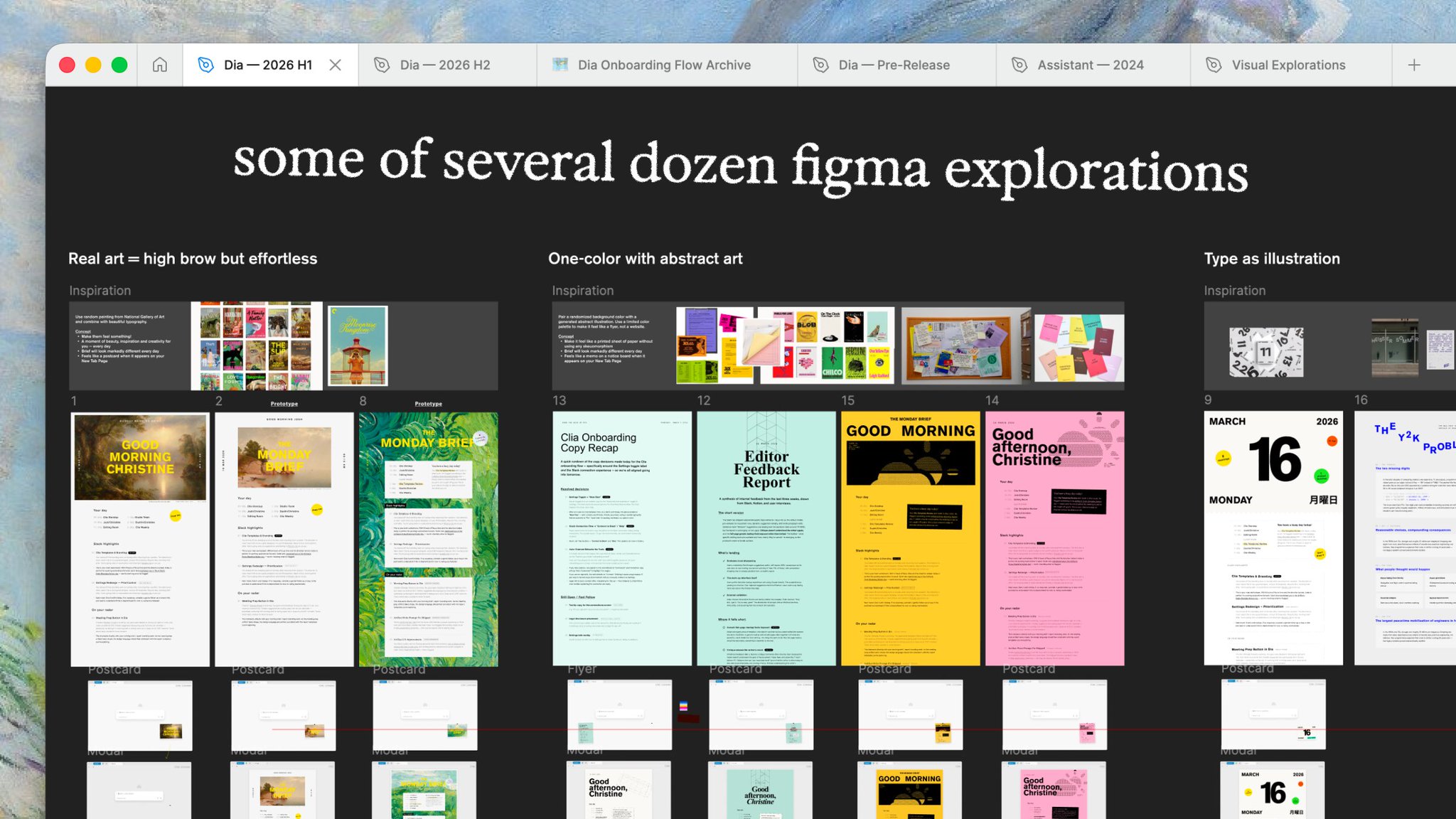
the design process started in Figma, but quickly moved to Cursor for higher fidelity prototyping. it's been so empowering to own the execution on this level — to spend hours on every viewport, mode, and hover state, instead of driving engineers mad with my perfectionism.
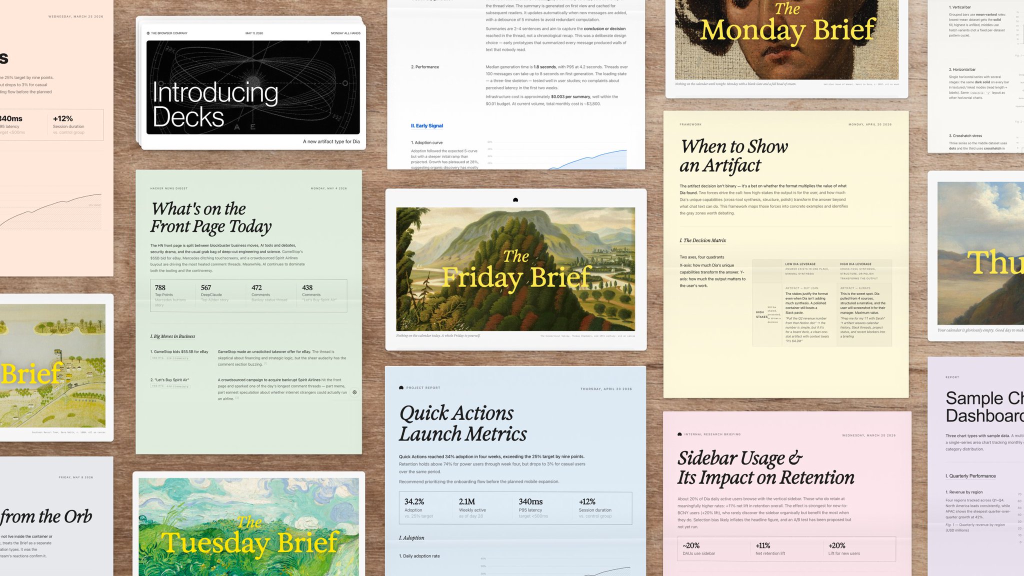
reports are deferential. it’s your document, so Dia steps back. the Morning Brief is the opposite: opinionated, maximum expression, directly from Dia. it shows up first thing every day. instead of another stressful dashboard — can we make the start of your day better? calmer?
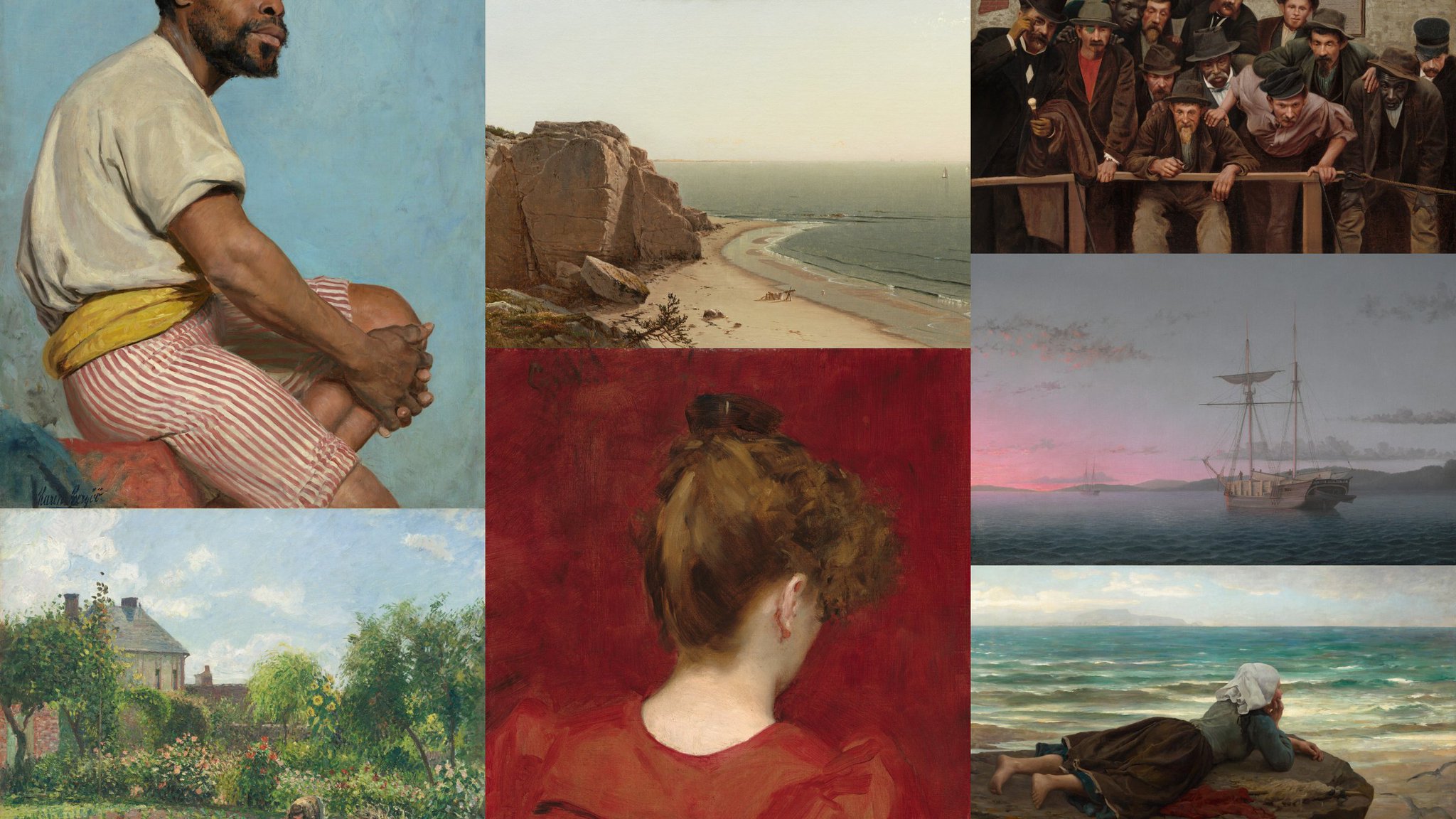
what if the morning brief felt like receiving a lovely, personal postcard? every brief features a public domain painting from the National Gallery of Art. words by LLMs, deliberately set against their antithesis: centuries-old, handmade art. all manually curated.
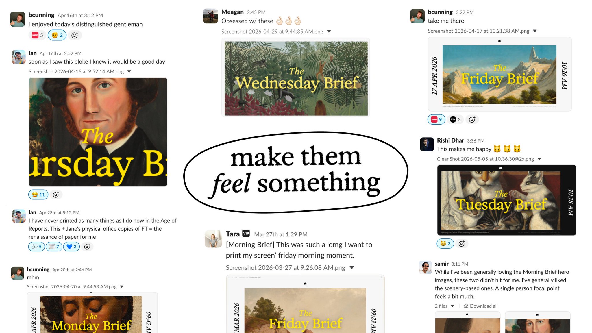
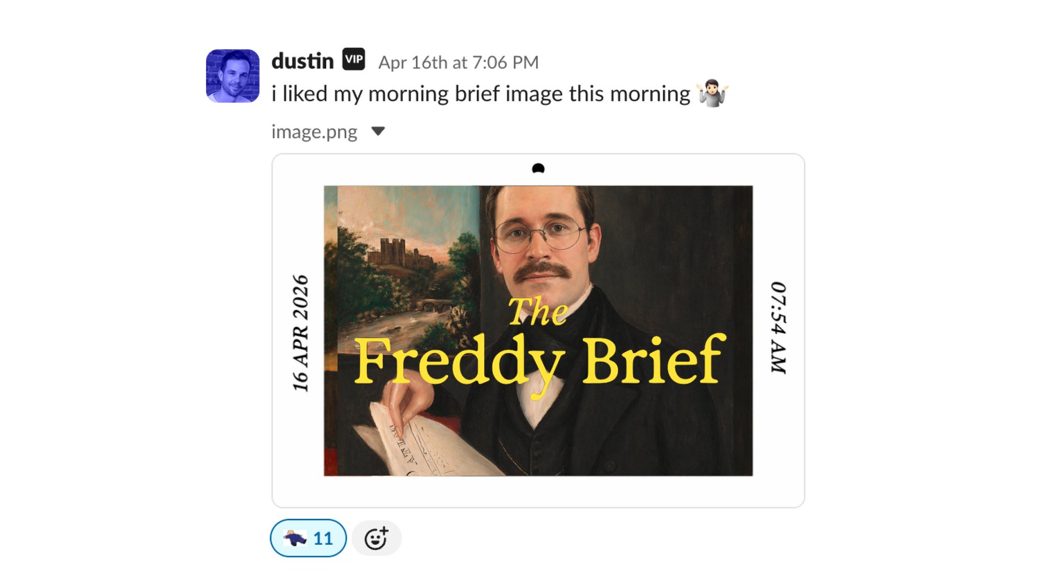
everyone gets the same art. we wanted to see: could art spark discussion? a watercooler moment? and nothing has made me happier than seeing the reactions inside and outside the company. because underneath all of this is a single goal, one of our company values:
obviously, all this took a whole amazing team: massive shout out to @jonathan_jlo for relentless prototyping, @jeffrafter for caring about grids even more than i do, and @jumhyn for being the voice of reason when it comes to avant-garde chart textures now onto the next project 🚀